Desktop
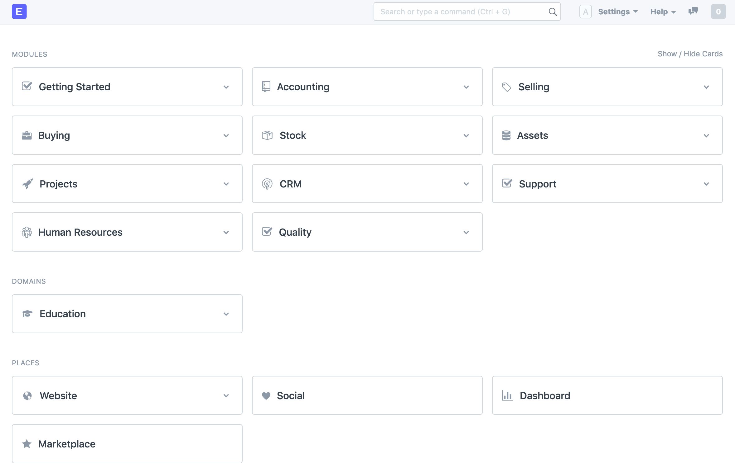
The moment a User logs into the system they will be able to see a Home Screen wherein all the Modules and Domains will be listed in the form of cards.
Their cards are a replacement to the erstwhile Module icons which were present in ERPNext versions before version 12.

These cards can be classified into four categories, namely:
- Modules: These are all the domain agnostic modules available in ERPNext that are common to all types of businesses. Modules like Human Resources, CRM, Buying, Selling, etc. are put under this category.
- Domains: This is where you can find all domain-specific modules like Education and Manufacturing. You can learn more about all industry-specific modules here.
- Places: Places is where you can find features that are not industry-specific and are not required in day to day operations of your company. Features like Website, Dashboards, and Marketplace can be found here.
- Administration: Here you can find modules related to your ERPNext setup and administration.
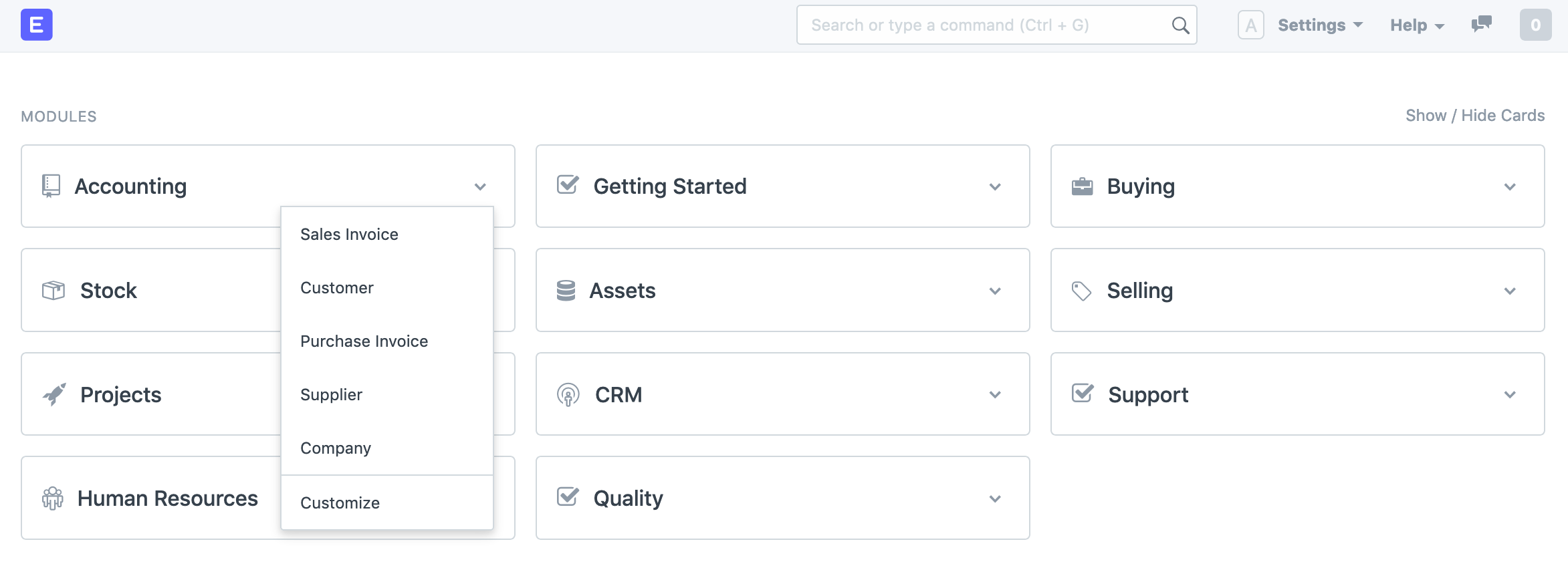
These cards allow better navigation with shortcut items in the drop-down menu. You can customize this drop-down to add or remove links to various DocType for that module.

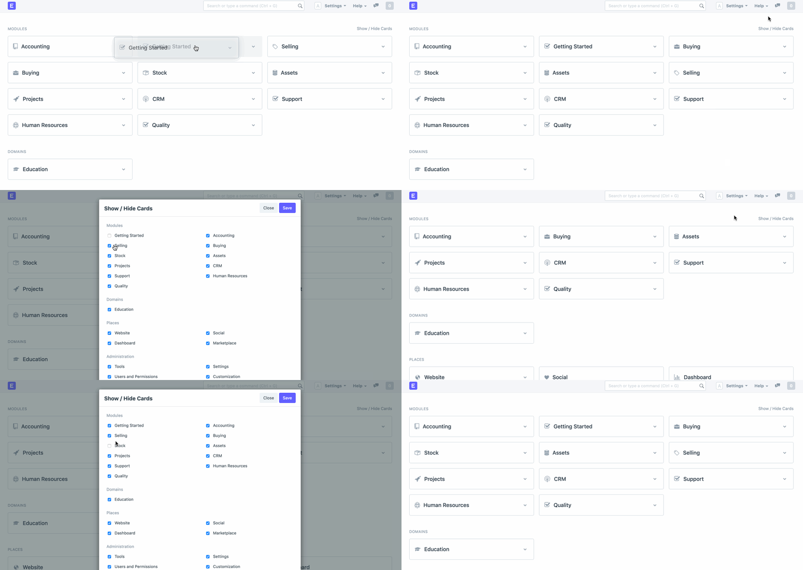
You can reorder as well as show or hide these module cards.

Module Page
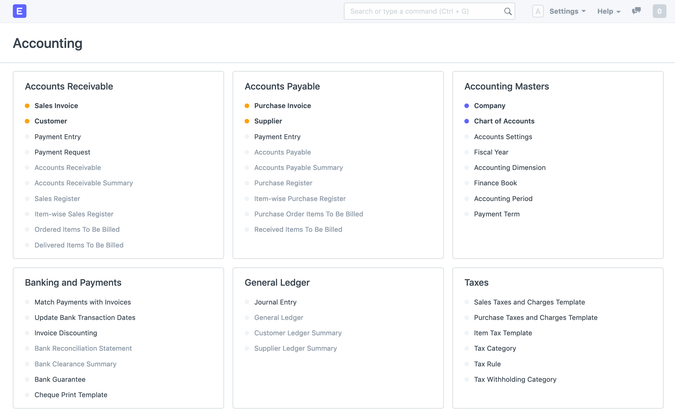
Clicking on any module card will take you to the module page. Here the user can navigate through all the doctypes, reports, and settings associated with a particular module.
For example, here is how the Accounting module page looks like.

Navigating the page
Some links of these modules may be marked grey, clicking on these links won't open any new page. They are marked so because there is a dependent document that needs to be created first. For example, you will need to build a Sales Invoice before accessing the sales register. Hovering on any of these links will show a pop-up guiding the user to the dependent document.

You shall also notice a color indicator before some of the links. These indicators are used to inform the user if any open or urgent documents need to be looked at.

- The red indicator in the above example indicated that there are open or overdue tasks on the list.
- Similarly, a blue indicator would mean that there are no open tasks.
- An orange indicator means that the report has not been accessed or no document is created in the corresponding doctype.